The Apple website is now iOS 7-enabled. There you can watch Apple's new iOS 7 video, in which Jony Ive speaks truly eloquently about the new design of iOS and Craig Federighi waxes poetic about the new features associated with the design. The design is clearly new and truly well done. The new features are certainly new to iOS but most of them are not new to mobile devices, although AirDrop - which we'll get to - is certainly a new and cool capability and answers not only a need but also provides a marketing response to a certain element of various Samsung commercials.
Readers interested in an overview of the entirety of Apple's 2013 World Wide Developers' Conference keynote should check out our overview article. Our story here will focus specifically on iOS 7.
Before we begin there is something important we need to note: now that we've seen iOS 7 the open question is what we will see in the form of actual hardware in the coming months. More likely than not, the next generation of iDevices will come with faster microprocessors, faster graphics processors and better displays. The next flagship generation of iPhone doesn't merely have to support iOS 7 - it will take iOS 7 to a level current devices cannot - especially in terms of UI crispness and overall application performance. Demonstrations of truly new innovation however remain absent - we'll need to wait until at least until Apple's next hardware event takes place at some point in the future to see what may emerge.
The only word that comes to mind for the UI design itself - which includes new color palettes, icon design, typography, animated wallpapers, the use of translucence (aka the frosted glass effect), and the way the display itself behaves relative to user movements - is true artistry. We think so - others, including various snarky professional designers, may find it derivative and underwhelming - but what do they know?
It is eloquently elegant and a fitting next step in iOS look and feel design. While the overall components have become flatter, the overall effect has been to increase display depth. We are already anxious to get it in hand but alas it is now in beta and will not become available until later in the year, no doubt to be formally launched in conjunction with Apple's next iPhone (or iPhones). Our comments - as are those of just about everyone else - are based on what we've seen, not what we've actually touched.
We'll cover the design issues first, and then transition to the upgraded, updated and new features. In order to understand the one true new UI feature - a subtle yet amazing parallax effect, take a look at the image below. Design of course is much better demonstrated with images so bear with us on this - a picture does paint a thousand words.
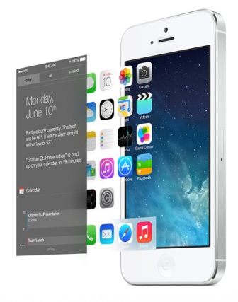
There are essentially three active layers here. The notification window shown as the first layer can be slid down from the top, but that layer also adds a new control center that slides from the bottom up. The icon layer, which also includes an entirely new folder look, sits between the notification layer and the background layer, which can now handle animated backgrounds and wallpaper. Let's take a closer look at the icon layer and the newly designed icons themselves.
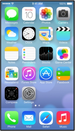
By far the most stunning design feature is immediately noticeable on the upper left - the traditional five-bar signal strength meter has been replaced with five dots. Bar meters have been around forever - it's about time someone stepped up to change it.
Take a look at the Newsstand icon - no signs of "wood shelves" anywhere. With the Game Center icon there is no sign of the hideous pool or poker table "green felt" to be seen either. Nor anything bound in leather and certainly no yellow legal pads. As we all knew would be the case every last instance of skeuomorphism has been wiped from the face of Apple earth.
That said is there even one icon here that any iPhone user would not manage to recognize? Absolutely not. They are all different than they were - cleaner, simpler, more reliant on color - yet they are all still the same. The new Game Center icon however seriously lacks imagination (it reminds us of two year old birthday party balloons).
We do not believe that any iOS user won't be able to quickly transition from old to new. The media noise about the new UI possibly polarizing the iOS user ecosystem (especially for those who like wooden shelves, green felt and yellow legal pads) strikes us as silly. It's time to move forward.
The subtle yet amazing - we actually want to say "delightful" - new parallax effect we noted above, known as parallax viewing, occurs as an interaction between the icon and background layers. iOS can now manipulate the icon and background layer visual relationship depending on how the user might move the phone around. Take a look at the two images shown side by side below. The one of the left shows the iPhone tilted horizontally to the left, while the one on the right is tilted to the right. Note that the icon layer and the background layer have both actually shifted not only relative to a straight ahead view to the iPhone itself but relative to each other.
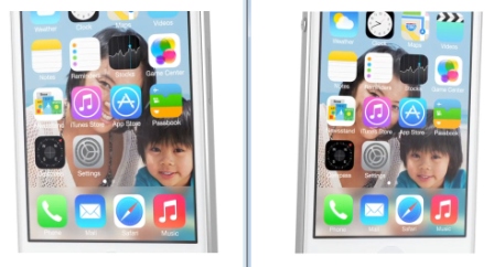
In fact, the icon layer, which is in the foreground and would therefore be relatively closer to the eye making the observation in a real three dimensional setting, appears to have shifted more than the background image, which in the real three dimensional world would be relatively farther away from the eye making the observation and would therefore be perceived as having moved a smaller amount. The physical movement of the screen left or right by the user changes the viewer's perspective of the icon layer, which doesn't actually move. The background image however actually shifts to create and enhance the overall 3D illusion and creates the parallax effect. Albert Einstein would certainly be proud. The result is that the user perceives a subtle yet very real sense of a three dimensional image on the display.
It is truly a delightful experience. Does it have any real world purpose other than to simply reflect the way we see the real world around us? No, but it's a great visual effect.
It works just as well when tilted vertically up or down, as the image below shows. In fact it will work around all 360 degrees, not just horizontally or vertically. The image below also demonstrates the new look of open folders (in this case the Games folder) as well as the new translucence capability. A layer sitting in front of another layer will display what's underneath it translucently, as shown. This allows the user to maintain a connection and a context with whatever is underneath the topmost image. There isn't anything particularly new or special here (Microsoft Aero, anyone?) but it is very nice to see on iOS. Others disagree and suggest that such an effect does nothing for visually aiding context.

Returning to the topmost layer, we won't cover the notification window although the look and feel has been similarly cleaned up, streamlined and made much less cluttered. But in the end it is still the familiar notification window all iOS users intimately know. What is now also available is the new Control Center that slides up from the bottom of the display. Android users will now have one less thing to claim sole ownership of. In truth this feature should have appeared at least as far back as iOS 5, but it has finally arrived. We think it is nicely uncluttered, though that may only be a matter of our opinion rather than fact.
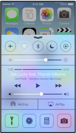
With the near instant flick of an upward motion from the bottom of the display upwards you now have the key things most people need to be able to control immediately at hand without the need for multiple menus of navigation. By the way, that icon shown in the lower left is an instantly available flashlight - how thoughtful of Apple to provide it though we won't get rid of our own favorite flashlight app.
New App Features - Complete with New UI Treats
For the most part the UI story we've told so far essentially covers the core aspects of the new Ive design. But Jony Ive, in his role as SVP of software and hardware design, didn't create the UI in a vacuum. He worked closely with his counterpart, Craig Federighi, SVP of engineering, to build the new features available in iOS 7. The UI story continues from above, but it continues in harmony with the new and newly updated applications that Federighi's team built. Form and function carry equal weight (though Ive probably has the ultimate upper hand in all cases).
We'll touch on the more interesting applications in our story - Safari, multitasking, AirDrop, the new Photo App and Moments, and iTunes Radio. But the upgraded feature list is a bit more extensive and includes Siri upgrades we won't cover here - other than to note that Apple has replaced the search engine Siri uses in searches from Google to Microsoft's Bing. That is a far from subtle change. There are also mostly trivial camera upgrades that lead to slightly better ease of use.
We will also note that there was nothing at all on mobile payments, mobile wallets or for that matter anything at all mentioned on Passbook. Will we when the next gen iPhone arrives? Will it be tied to NFC support? These remain unanswered questions.
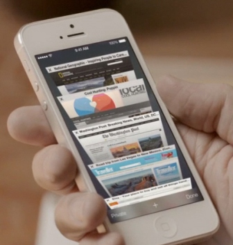
Perhaps the best example of form and function being equal is the reengineered Safari browser. Safari is now nicely cleaned up along the lines described more generally earlier, with a reimagined interface that flows naturally from what a user wants to do. Shown below is a new way to flip through Safari tabs - which are no longer limited to eight tabs. Yes, Apple has certainly used this UI approach elsewhere but it makes sense to offer this view in iOS Safari as well.
Interestingly, the next two features have parallels with what Google introduced a few weeks ago at its Google I/O developer conference - a new ability to auto-manage collections of photos and new streaming music services. Eerily parallel as well has been the very low key way that both Apple and Google have introduced their streaming music services.
Apple's new iTunes Radio streaming service (perhaps the company was being sensitive to how it might affect Pandora and kept it low key for that reason) was introduced simply as part of the newly updated iOS music app. It does exactly what a streaming music app needs to do, and allows users to create custom channels based on artists, song genres and so on. Music will be freely available with ads and will also be made available as a paid service without any ads. The iTunes Radio capability will be made available across all iTunes platforms as it isn't strictly an iOS service.
All in all it is not much different than what Google introduced. Considering the pre-conference tech media headlines and noise that iTunes Radio has generated about killing off Pandora, the announcement was completely anticlimactic and passed quickly from the stage. The image below shows an iTunes Radio screen on the left. On the right is a screen from iOS 7's new photo app.
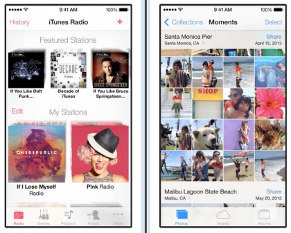
The new Photo app can now provide some automated management of user photos. Google's offers more sophisticated capabilities. The Photo app takes advantage of knowing the time photos were taken, as well as their geo-locations. Using this info it is able to now group photos into "moments" - hence the Moments name in the image above. We won't delve into the details of the app itself but we will note that others can add photos to shared Moments collections.
What's more important here is the UI that is shown for both apps. The design remains clean, and note that the status bar at the top of the screen has now been incorporated into the design - the bar changes background and foreground with the app. It is a subtle way to make the display feel just a tiny bit larger without actually changing anything. There is lots of color here yet the apps themselves taking up the display remain bright and clean. We like the visuals here a great deal but of course actual use will be required to pass real judgments.
Full iOS Multitasking - Finally
A significant change from all previous versions of iOS is the introduction of full multitasking and a variety of multitasking-based optimizations. Apple has always kept a tight control on multitasking - it's always been inherently available, but Apple has always preferred to lock it down in the interest of preserving battery life. Later versions of iOS did deliver on certain tightly controlled multitasking capabilities. Now iOS 7 changes all of that, and with full-on multitasking Android users lose one more claim to owning something iOS owners don't.
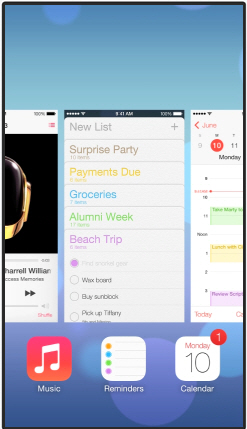
From an interface perspective let's be very clear - Apple stole its "card" design for flipping through and controlling those multitasking apps from HP's Palm OS. Steve Jobs old saying about real artists stealing (rather than borrowing) has never been truer - watching the multitasking demo makes this abundantly clear. It is Palm's approach without a doubt - and Palm's approach has been a long time favorite of ours. That there are a lot of ex-Palm employees at Apple clearly has something to do with this of course - they must be thrilled to finally see their ideas become real across what will be a vast ecosystem of users! Below is an image showing the application cards for multitasking apps.
Finally we arrive at the new AirDrop capability. What this new capability delivers is easy over the air (OTA) sharing of content with any number of other iPhone users who are in the same general proximity. The way AirDrop works is that it makes use of a Share button and iOS share sheet capabilities - which are a part of the Facebook integration with iOS 6. A share sheet discussion is outside the scope of our story here, but AirDrop will use the capability to allow instant OTA sharing. AirDrop can also handle sharing outside of share sheets as well, though share sheets make the process very simple. Below are several images of the AirDrop app in action.
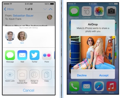
AirDrop makes use of both Bluetooth and Wi-Fi to share content. That content, by the way, is encrypted before it is shared. AirDrop will track anyone who is available to share with; however, users can choose to be seen as available or not available. AirDrop will only be available with the iPhone 5, iPad Mini and Next Gen iPad 4 and beyond - so Apple 4 and 4S users won't be able to play here.
Time for Aggressive Marketing
AirDrop adds one more thing certain competitors can no longer claim for themselves. In this case let's consider Samsung and its "bump to share" technology. With AirDrop no one needs to go around bumping anything. Federighi certainly was pointed about this while on stage - saying something along the lines of, "no need to see a bunch of people running around bumping their phones." It will be interesting to see if Apple does anything aggressive here from a marketing perspective.
Certainly from a marketing perspective Apple has been sitting back and letting Samsung take the stage away from it and bump sharing has been a key part of it - perhaps now Apple will take its turn at aggressive marketing. It remains to be seen. Tim Cook did show a commercial at the end of the keynote that is in our estimation exceedingly soft - in fact it's almost somber. It is now live on TV so chances are you will come across it.
The ad focuses on Apple creating great products that enhance and enrich lives…but from a marketing perspective it simply isn't going to work. It perhaps shows Apple taking the high road here, but Apple needs to get funny, get aggressive and demonstrate excitement about what users can do. Apple's ads need to be about in the moment mobile action and features, not about quiet reflection. Perhaps these will come once the new iPhone is announced and iOS 7 ships, but we do not believe Apple is on the right track with the current ad.
Innovation?
The real innovation that we caught a glimpse of during the keynote was the sneak peak at the new Mac Pro, an absolutely sexy and gleaming little 10-inch high cylinder representing the new state of the art in desktop computing. We'll cover this new tech elsewhere, but suffice it to say there was nothing else that even came close to it innovation-wise.
Yes, in our opinion the new iOS 7 demonstrates true artistry - both in pure design and in design-engineering integration. But at the end of the day there is nothing new in terms of what we can do, how that new Mac Pro and the new Mac OS Mavericks operating system and apps can, will or should integrate with iOS 7 and iOS 7 devices and apps, or what will come next on the mobile horizon.
Though far less gimmicky than what Samsung has imbued its Samsung Galaxy S4 with from an apps and features perspective, and as much as we can personally see that we ourselves will greatly prefer iOS 7 to Samsung's S4 and other Android interfaces, in the end we can still more or less do only the same "old" mobile things with both.
We'll close by suggesting that we need to consider iOS 7 as a building block to hopefully getting to that next generation of innovation. We'll see what Apple has in store for us with its next gen mobile devices when they finally get around to holding that event. WWDC wasn't it for the innovation we're looking for - perhaps the next event will be.
Edited by
Alisen Downey